I thought I would go back and review all the digital painting #digitalPainting work I have done over the last couple of years and do a little bit of introspection. Have I learned anything or made progress? Did I achieve what I was trying to do? Are there good ideas that I have subsequently lost again? All part of the learning process. Of course, your thoughts are most welcome too …
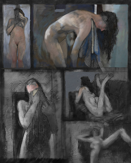
Drawing 100 – A digital painting in Comic page style
The first one, above was an attempt to think about a digital painting using traditional painting techniques, but in a comic book style. Looking back at this, although I didn’t get very far, I like the idea, and it fits with my theme that I did for an end-of-year show about telling the story of working with a model. I like some of the colours that were starting to come through – the blues and browns and pinks working nicely together. As in many of the earlier works, the texture does start to “fight” a bit with the image.
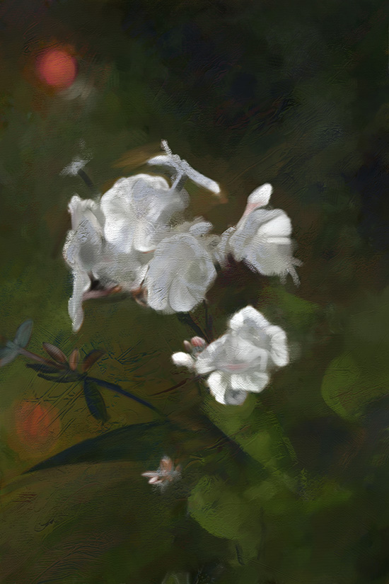
Drawing 101 – A digital painting of flowers
Some nice colours, particularly in the greys, but feels a little disconnected between foreground and background. Drawing is too sharp in the wrong areas (e.g. dark leaf in background)
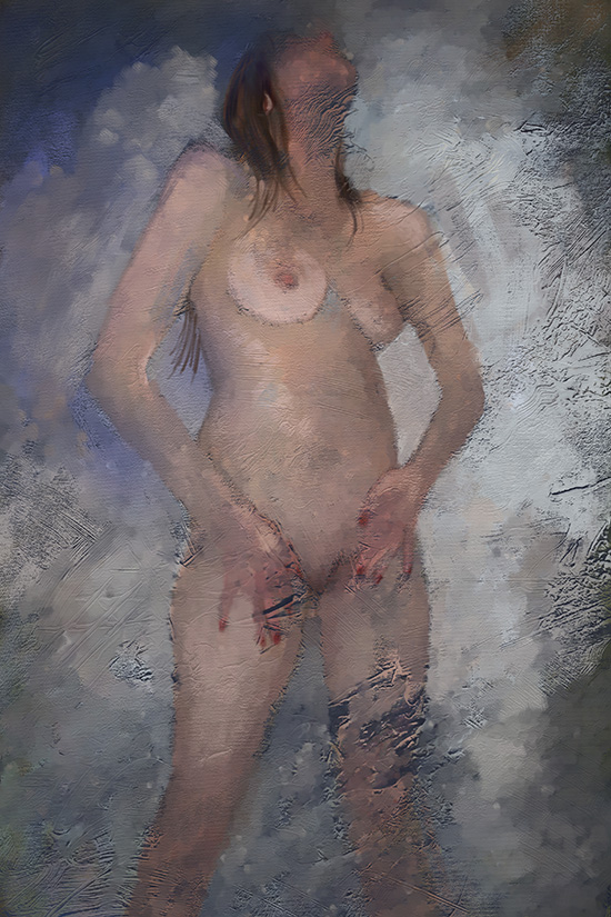
102 Digital Painting of Josie in the shower
Although she was just washing herself I liked the edgy eroticism of this one. I like some of the colours, particularly in the body, although I think the form has been lost a lot. Some of the edge work is a little too sharp in the worng places, but overall there is a better sense of the painting and the texture both existing. Funny how looking back stuff seems better than you remember 🙂
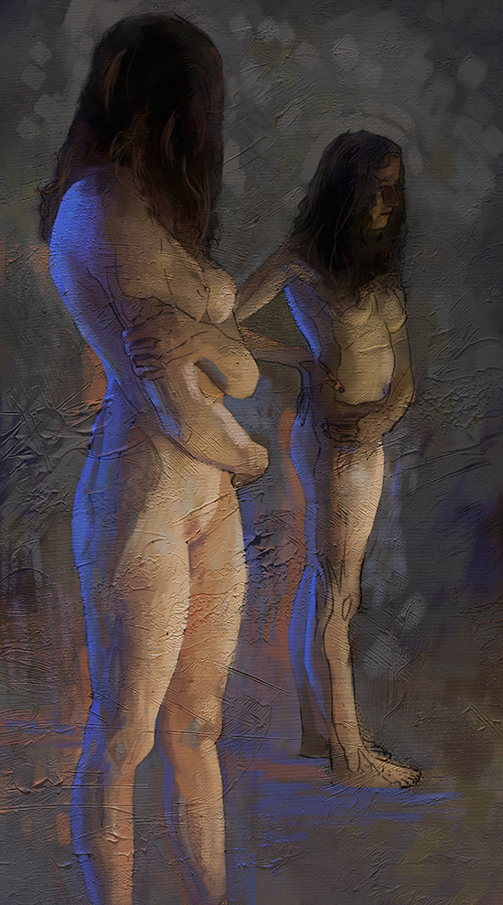
103 – Digital Painting of Josie in the mirror
Based on the last one, I think I decided to do a bit more with the drawing (tracing) which has worked in some ways, but I think has too much sharp defined edges for what I am trying to do. Also struggling with the sense of scale between the details (e.g. fingers and toes) versus the texture scale. Also the texture looks a little more embossed and it doesn’t look like the digital tools have interacted with it at all. I do still like the theatrical two point lighting – good form reveal and makes for interesting shapes. Still a strong part of my work.
Do let me know what you think – all comments welcome.
